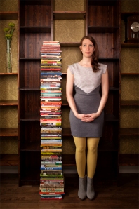
Jordan Simpson: Book design has been around for a long time. Like, a really long time. It’s been around since people first put ink/dye/blood to paper, papyrus or animal, or even human skin (yes, human skin; there’s a few books bound entirely in the stuff but that’s for another article). And its guiding principle is of the noblest of causes to the writer: making an author’s work organized, legible and attractive to read. In its own way, design gives the words on the page extra power for the reader. It can engage the reader on another level by intriguing them, seducing them, or entertaining them through simple things like typeface, colour, and layout. I mean, who doesn’t appreciate a sexy-looking book? So as an introduction to the occasionally mentioned craft, FreeFall sat down with Natalie Olsen, cover and book designer extraordinaire based in Inglewood and had a nice chat about her art. Olsen, who’s worked with a variety of clients ranging from the Book Publishers Association of Alberta to University of Toronto Press, has designed as her website says, a “5’9” stack of books” (re: a lot). You can check out her super well-designed site, here.
Could you define what book design is in your terms?
Natalie Olsen: Book design is an opportunity to package a story for a reader. This package will entice a person to pick up a book, it will accompany them while they turn pages, and it will stay with them long after they finish reading, on a shelf, as a memento of the story.
When I say I’m into page layout and design, a lot of people give me a blank stare. Explain why book design is important to any work–as if I needed convincing.
There is a lovely line by the late Monroe Wheeler, Museum of Modern Art publication curator-extraordinaire, that would be an impressive comeback to toss at anyone questioning the merit of this craft: “Book design is one of the excellencies by which a civilization can be measured.”
A more modest response might claim that strong page layout and typography are crucial ingredients for a positive reading experience. Perhaps people take for granted that information is usually published in a legible format that is a pleasure to read. This isn’t automatically the case: line lengths can be too long, the text setting too small and too dense, the hierarchy of information unclear — things that result in sore eyes and very little appreciation of, or confidence in, the publication. Book design has the power to clarify, embellish, disguise, or even completely obscure the meaning of a text. That is a lot of power to hold.
Can you detail your process?
My process depends on the practical constraints for each unique project. Things like genre, audience, budget, timeframe, client requests, and the amount of caffeine I have consumed that day. But for the most part, I sit in a stereotypical Herman Miller chair, reading manuscripts, and traversing the needs of the publisher, the editor, the sales department, the author, the author’s mom/kids/cat, and that voice in my head that pushes me to make good work.
I think it’s safe to assume book designers can be obsessive over the small details. What’s some that you could describe that most readers just gloss over.
I won’t delve into the hours spent pondering the length of em dashes or developing an ability to distinguish an italic period from a roman one.
Typeface selection is an example of something that could go unnoticed by a reader whose font recognition doesn’t extend beyond Times New Roman. Book designers conduct considerable type research in order to make informed selections that suit the nature of the text they are working with.
Raphaël Daudelin and Anouk Pennel of Studio FEED in Montreal recently created a typeface called “Wigrum” specifically for use in Daniel Canty’s novel of the same name (Talonbooks, 2013). If this amazing detail isn’t acknowledged in a colophon at the back of the book, then it might slip past readers.
Another detail worth obsessing over is the treatment of the folios [page numbers]. Robert Bringhurst might not approve of handling the running heads/footers in a way that attracts attention, but I think a balance between functional and fun can be achieved. A perfectly executed example of this lies in the margins of Haruki Murakami’s 1Q84. I can’t even begin to summarize the plot of that epic book with any grace, but all you need to know right now, is that the main character notices discrepancies in her environment and realizes that she has entered a parallel existence at some point. So the designers, Chip Kidd and Maggie Hinders, ran the folios in correct orientation on some pages, and flipped them to show the mirror image on the facing page — a backward number — to represent the alternate reality. As a reader, it’s incredibly rewarding to discover such a playful and meaningful detail while turning (so many) pages.
What qualifies as good design in your opinion? How about bad?
Good book design shows a sensitivity to the author’s intent, and attempts to augment the content through thoughtful organization and visual detail. I think you can tell if a designer has read and connected with a manuscript, or if they’ve just dressed it up to sell.
Bad book design is simply no book design at all. Many publishers and self-published authors don’t invest in this step of the book-making process, which is always disappointing.
What stands out for you in book design?
It’s easy to be seduced by sexy production techniques—spot gloss, vellum overlays, die cuts, neon or metallic ink, embossing, expensive end papers… Riverhead Books 3D-printed a slipcase for Chang-rae Lee’s On Such a Full Sea. When these things fail to entice, I’m attracted to simplicity, cleverness, and resourcefulness. I like to see details from the jacket design carried through the interior of the book, to create a cohesive package.
The design of The Dilettantes by Michael Hingston (Freehand Books, 2013) contains “marginalia” such as a fictional albeit fairly accurate IMDB actor profile and Metro newspaper clipping. Were these elements already in the story and you expanded on them or were they your own making?
These elements were first imagined by the author in the form of 12-point Times New Roman text in a Word Document, and it was my job to give them some life on the page. It was a challenge to create convincing replicas of things like text messages and website interfaces to evoke a specific time and place (student life at Simon Fraser University in 2009), while maintaining the visual identity for the book as a whole. There was some back-and-forth with Michael, and in the end we achieved a happy balance between accurate and stylized.
Do you have a working relationship with the actual author of the novel or work? If so, what’s your process for working with them?
Sometimes, if I’m lucky, I get to work closely with authors. We get to drink some wine, discuss the project informally, and I gain some perspective from the person who knows the work intimately. Other times, this step isn’t part of the publisher’s process, so I work with the creative brief and manuscript alone, and the author’s feedback arrives at a later stage.
The design of House of Spells by R. Pepper-Smith (NeWest Press, 2011) invites readers to physically interact with the book by providing a template to cut out and build a paper house. In what other ways can you make a print design “interactive”?
Successfully prompting a reader to build something with their hands, as inspired by a book, would be such an interactive print design coup. I’d love to hear if someone actually did that with House of Spells.
I think orientation is another thing to play with: asking readers to rotate or flip a book in their hands in order to actively experience it from different viewpoints.
Natalie pulls out the book Composition No. 1 by Marc Saporta and quotes: “We think that books should be as visually interesting as the stories they tell.” By forgoing binding altogether and packaging this book as loose pages in a box, the order of the narrative is determined entirely by the reader. And after accidentally dropping the pages on the floor, which, let’s be honest, will probably happen, the reader can have an entirely new experience the second time around.
One book’s design that really jumps out as challenging traditional design in books is Mark Z. Danielewski’s House of Leaves. The story is told through footnotes that may or may not be correct, references to fictional and real works, and pages with wildly different amounts of text. Do think it stands alone or that designers are trying to get away from conventional formats as of late?
It definitely doesn’t, and shouldn’t, stand alone. Considering the present-day blur of traditional and digital in the publishing industry, there is so much room for experimentation. Love and the Mess We’re In by Stephen Marche, typeset and published by Andrew Steeves at Gasperau Press, is another collaborative editorial-design effort resulting in poly-schematic pages that tell a story in a non-linear way. These complex layouts demand extra attention and participation by the reader, bringing us back to the concept of reader experience: can the book design not only encourage a pleasurable act of reading, but also make it an authentic and memorable one?
Natalie Olsen is an Observer; a Question-asker; a Juggler; an Interpreter; a Wanderer; a Collector; a Collager; a Critic; a Recycler; a Presenter; a Doodler; the Owner of a company called Kisscut Design (having nothing to do with canoodling or sharp-edged tools); a Freelance Book Designer for various publishers across North America; the Recipient of some flattering tweets, gifted bottles of scotch, and awards; but first and foremost, a Reader.
Noteworthy publishing projects, both the fiascos and successes, are sometimes documented late at night on her blog: www.kisscutdesign.com
This is exclusive FreeFall blog content by Jordan Simpson.
Jordan Simpson is a freelance designer, media specialist and graduate of Mount Royal University’s journalism program. But his other titles have included tin basher, asbestos removal technician, bellhop, communications advisor, editor, reporter, short story writer, intern, Red Cross canvaser, and (one-time, I swear) Juggalo.


